
🎞️布局组件介绍
主轴&交叉轴
主轴
在布局容器中,默认存在两根轴,分别是主轴和交叉轴,不同的容器中主轴的方向不一样的。
交叉轴
与主轴垂直相交的轴线,如果主轴是垂直方向,则交叉轴就是水平方向;如果主轴是水平方向,则交叉轴是垂直方向
Row(行)组件
Row组件是沿水平方向布局,主轴在水平方向,交叉轴是垂直方向。
参数
| 参数名 | 参数类型 | 是否必填 | 说明 | 补充描述 |
|---|---|---|---|---|
| space | string/number | 否 | 横向布局元素间距 | 值为负数或者justifyContent设置为FlexAlign.SpaceBetween、FlexAlign.SpaceAround、FlexAlign.SpaceEvenly 时不生效。 |
属性
| 名称 | 参数类型 | 类型枚举 | 描述 |
|---|---|---|---|
| alignItems | VerticalAlign | Top、Center、Bottom | 设置子组件在垂直方向上的对齐格式。默认值:VerticalAlign.Center |
| justifyContent | FlexAlign | Start、Center、End、SpaceBetween、SpaceAround、SpaceEvenly | 设置子组件在水平方向上的对齐格式。默认值:FlexAlign.Start |
用法示例
@Entry
@Component
struct row {
  build() {
    Column({ space: 10 }) {
      // space
      Text('space').fontSize(50)
      Row({ space: 10 }) {
        Text('1')
          .width('42%')
          .height(80)
          .backgroundColor(0xF5DEB3)
          .textAlign(TextAlign.Center)
        Text('2')
          .width('42%')
          .height(80)
          .backgroundColor(0xD2B48C)
          .textAlign(TextAlign.Center)
      }
      .width('100%')
      .backgroundColor('#eee')

      // alignItems
      Text('alignItems').fontSize(50)
      Row() {
        Text('1')
          .width('42%')
          .height(80)
          .backgroundColor(0xF5DEB3)
          .textAlign(TextAlign.Center)
        Text('2')
          .width('42%')
          .height(80)
          .backgroundColor(0xD2B48C)
          .textAlign(TextAlign.Center)
      }
      .width('100%')
      .height(120)
      .backgroundColor('#eee')
      .alignItems(VerticalAlign.Bottom)


      // justifyContent
      Text('justifyContent').fontSize(50)
      Row() {
        Text('1')
          .width('42%')
          .height(80)
          .backgroundColor(0xF5DEB3)
          .textAlign(TextAlign.Center)
        Text('2')
          .width('42%')
          .height(80)
          .backgroundColor(0xD2B48C)
          .textAlign(TextAlign.Center)
      }
      .width('100%')
      .height(120)
      .backgroundColor('#eee')
      .justifyContent(FlexAlign.SpaceEvenly)

    }
    .width('100%')
    .height('100%')

  }
}
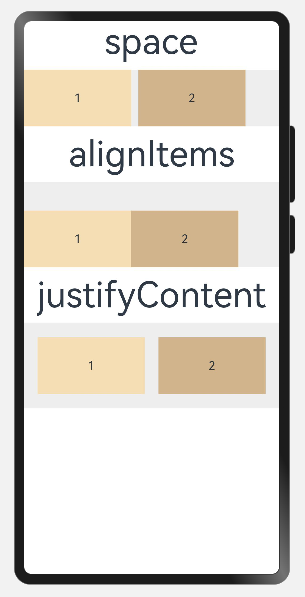
效果:
Column(列)组件
Column组件是沿垂直方向布局,主轴在垂直方向,交叉轴是水平方向。
参数
| 参数名 | 参数类型 | 是否必填 | 说明 | 补充描述 |
|---|---|---|---|---|
| space | string/number | 否 | 纵向布局元素垂直方向间距 | 值为负数或者justifyContent设置为FlexAlign.SpaceBetween、FlexAlign.SpaceAround、FlexAlign.SpaceEvenly 时不生效。 |
属性
除支持通用属性外,还支持以下属性:
| 名称 | 参数类型 | 类型枚举 | 描述 |
|---|---|---|---|
| alignItems | HorizontalAlign | Start、Center、End | 设置子组件在水平方向上的对齐格式。默认值:HorizontalAlign.Center |
| justifyContent | FlexAlign | Start、Center、End、SpaceBetween、SpaceAround、SpaceEvenly | 设置子组件在垂直方向上的对齐格式。默认值:FlexAlign.Start |
用法示例
@Entry
@Component
struct column {
  build() {
    Column({ space: 10 }) {
      // space
      Text('space').fontSize(50)
      Column({ space: 10 }) {
        Text('1')
          .width('100%')
          .height(50)
          .backgroundColor(0xF5DEB3)
          .textAlign(TextAlign.Center)
        Text('2')
          .width('100%')
          .height(50)
          .backgroundColor(0xD2B48C)
          .textAlign(TextAlign.Center)
      }
      .width('100%')
      .height(150)
      .backgroundColor('#eee')

      // alignItems
      Text('alignItems').fontSize(50)
      Column() {
        Text('1')
          .width('50%')
          .height(50)
          .backgroundColor(0xF5DEB3)
          .textAlign(TextAlign.Center)
      }
      .width('100%')
      .height(80)
      .backgroundColor('#eee')
      .alignItems(HorizontalAlign.End)


      // justifyContent
      Text('justifyContent').fontSize(50)
      Column() {
        Text('1')
          .width('50%')
          .height(50)
          .backgroundColor(0xF5DEB3)
          .textAlign(TextAlign.Center)
      }
      .width('100%')
      .height(80)
      .backgroundColor('#eee')
      .justifyContent(FlexAlign.Center)

    }
    .width('100%')
    .height('100%')

  }
}
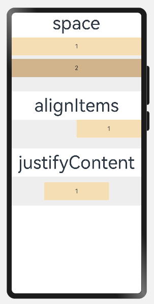
效果:
Flex(弹性)组件
Flex组件以弹性方式布局,可以通过 direction 参数设置主轴方向,值为 Column 时,主轴是垂直方向,值为 Row 时,主轴是水平方向。
参数
| 参数名 | 参数类型 | 类型枚举 | 是否必填 | 描述 |
|---|---|---|---|---|
| direction | FlexDirectio | Row、RowReverse、Column、ColumnReverse | 否 | 设置Flex容器的主轴方向。默认值:FlexDirection.Row |
| wrap | FlexWrap | NoWrap、Wrap、WrapReverse | 否 | 设置Flex容器是单行/列还是多行/列排列。默认值:FlexWrap.NoWrap |
| justifyContent | FlexAlign | Start、Center、End、SpaceBetween、SpaceAround、SpaceEvenly | 否 | 设置Flex容器的主轴方向的对齐格式。默认值:FlexAlign.Start |
| alignItems | ItemAlign | Auto、Start、Center、End、Stretch、Baseline | 否 | 设置Flex容器的交叉轴方向的对齐格式。默认值:ItemAlign.Start |
| alignContent | FlexAlign | Start、Center、End、SpaceBetween、SpaceAround、SpaceEvenly | 否 | 设置Flex容器的交叉轴方向存在额外空间时,多行内容的对齐格式。默认值:FlexAlign.Start |
用法示例
@Entry
@Component
struct flex1 {
build() {
Column({ space: 10 }) {
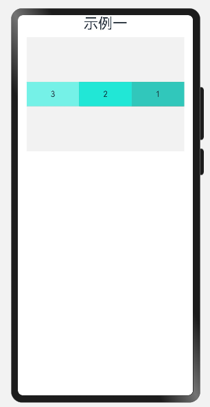
// 示例一:direction、wrap、alignItems
Text('示例一').fontSize(30)
Flex({
direction: FlexDirection.RowReverse,
wrap: FlexWrap.NoWrap,
alignItems: ItemAlign.Center
}) {
Text('1')
.width('50%')
.height(50)
.backgroundColor('#ff31c8bb')
.textAlign(TextAlign.Center)
Text('2')
.width('50%')
.height(50)
.backgroundColor('#ff20e7d6')
.textAlign(TextAlign.Center)
Text('3')
.width('50%')
.height(50)
.backgroundColor('#ff76f1e7')
.textAlign(TextAlign.Center)
}
.width('90%')
.height('30%')
.backgroundColor('#c4eeeeee')
}
.width('100%')
.height('100%')
}
}
效果一:
@Entry
@Component
struct flex2 {
build() {
Column({ space: 10 }) {
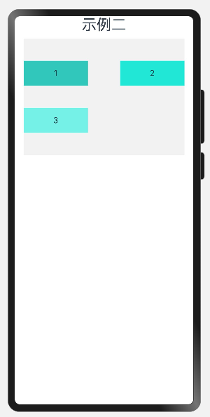
// 示例二:direction、wrap、justifyContent、alignContent
Text('示例二').fontSize(30)
Flex({
direction: FlexDirection.Row,
wrap: FlexWrap.Wrap,
justifyContent: FlexAlign.SpaceBetween,
alignContent: FlexAlign.SpaceEvenly
}) {
Text('1')
.width('40%')
.height(50)
.backgroundColor('#ff31c8bb')
.textAlign(TextAlign.Center)
Text('2')
.width('40%')
.height(50)
.backgroundColor('#ff20e7d6')
.textAlign(TextAlign.Center)
Text('3')
.width('40%')
.height(50)
.backgroundColor('#ff76f1e7')
.textAlign(TextAlign.Center)
}
.width('90%')
.height('30%')
.backgroundColor('#c4eeeeee')
}
.width('100%')
.height('100%')
}
}
效果二:
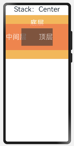
Stack(堆叠)组件
Stack组件没有明确主轴与交叉轴,通过设置 alignContent 参数来改变容器内组件的对齐方式。
子组件按照顺序依次入栈,后一个子组件覆盖前一个子组件。
如果要改变某一个子组件的层级,可通过设置子组件 zIndex 属性进行调整。
参数
| 参数名 | 参数类型 | 类型枚举 | 是否必填 | 描述 |
|---|---|---|---|---|
| alignContent | Alignment | TopStart、Top、TopEnd、Start、Center、End、BottomStart、Bottom、BottomEnd | 否 | 设置子组件在容器内的对齐方式。默认值:Alignment.Center |
属性
除支持通用属性外,还支持以下属性:
| 名称 | 参数类型 | 类型枚举 | 描述 |
|---|---|---|---|
| alignContent | Alignment | TopStart、Top、TopEnd、Start、Center、End、BottomStart、Bottom、BottomEnd | 设置所有子组件在容器内的对齐方式。默认值:Alignment.Center。与通用属性 align 同时设置时,后设置的属性生效。(从API version 9开始,该接口支持在ArkTS卡片中使用) |
用法示例
@Entry
@Component
struct stack {
  build() {
    Column({ space: 10 }) {
      Text('Stack:Center').fontSize(40)
      Stack({ alignContent: Alignment.Center }) {
        Text('底层')
          .width('100%')
          .height('100%')
          .fontSize(40)
          .backgroundColor('#fff3b75b')
          .textAlign(TextAlign.Center)
          .baselineOffset(160)
          .fontColor(Color.White)

        Text('中间层')
          .width('100%')
          .height(150)
          .fontSize(40)
          .backgroundColor('#ffec6f4a')
          .textAlign(TextAlign.Start)

          .fontColor(Color.White)
          .opacity(0.7)

        Text('顶层')
          .width('50%')
          .height(100)
          .fontSize(40)
          .backgroundColor('#333')
          .textAlign(TextAlign.End)
          .fontColor(Color.White)
          .opacity(0.6)
      }
      .width('100%')
      .height(250)
      .backgroundColor('#eee')

    }
    .width('100%')
    .height('100%')
  }
}
效果:
🎞️列表布局示例
使用 Row组件 和 Column组件 简单实现列表页布局。

代码如下:
@Entry
@Component
struct list {
  @State avatars: any[] = [
    {
      avatar: 'images/a.png',
      nick: '不息de进步',
      sign: '唤起一天明月,照我满怀冰雪'
    },
    {
      avatar: 'images/d.png',
      nick: '无限de仙境',
      sign: '学习才是永久之计,它会带来人生中最大的奖励'
    },
    {
      avatar: 'images/f.png',
      nick: '轻巧de狂澜',
      sign: '送我一朵小红花吧?让它开在我新长的枝桠'
    },
    {
      avatar: 'images/j.png',
      nick: '浅红de豪情',
      sign: '凡事总有解决办法,奥斯卡,总会有那么一袋面粉在某处等你'
    },
    {
      avatar: 'images/x.png',
      nick: '诚实de科学',
      sign: '守着黑夜的阳光,难过却假装坚强'
    }
  ]

  build() {
    Column() {
      ForEach(this.avatars, (item: any) => {
        Row() {
          Column() {
            Image(item.avatar)
              .width(90)
              .width(90)
              .borderRadius(90)
          }

          Column() {
            Text(item.nick)
              .fontSize(24)
              .margin({ bottom: 12 })

            Text(item.sign)
              .fontSize(16)
              .fontColor('#999')
          }
          .width('60%')
          .margin({ left: 12 })
          .alignItems(HorizontalAlign.Start)

        }
        .width('90%')
        .padding(15)
        .backgroundColor('#eee')
        .margin({ top: 20 })
        .borderRadius(15)
        .alignItems(VerticalAlign.Top)

      })
    }
    .width('100%')
    .height('100%')
  }
}
效果: